Your Shopping Cart Is Being Manipulated — Here's Exactly How
You went online to buy one thing. You ended up with four. Sound familiar?
It's not a coincidence, and it's definitely not a willpower problem. The modern e-commerce checkout experience is the result of millions of dollars in user research, A/B testing, and psychological profiling — all aimed at one goal: increasing the amount you spend before you close the tab.
These techniques have a name: dark patterns. And once you learn to spot them, shopping online starts to feel a lot less like browsing and a lot more like navigating a maze that was built specifically to disorient you.
What Are Dark Patterns, Exactly?
The term "dark patterns" was coined by UX designer Harry Brignull back in 2010 to describe interface design choices that trick users into doing things they didn't intend to do. We're not talking about aggressive advertising or flashy sales banners — those are obvious. Dark patterns are subtler. They work by exploiting the way humans naturally process information, make decisions under time pressure, and default to the path of least resistance.
The Federal Trade Commission has actually started cracking down on some of these practices, but enforcement is slow and the tactics evolve fast. For now, your best defense is knowing what you're up against.
The Pre-Checked Box Problem
This is one of the oldest tricks in the digital playbook, and it's still everywhere.
You're moving through checkout, clicking through screens quickly because you've done this a hundred times. Somewhere in the middle — maybe on the shipping page, maybe right before payment — there's a checkbox you didn't notice. It's already checked. It says something like:
- "Add product protection for $7.99/month"
- "Sign me up for [Store] Premium for free for 30 days"
- "Include a gift message and premium packaging (+$4.99)"
Because it's pre-selected, your brain registers it as a default — something that's already been decided. Opting out requires active effort, and when you're in checkout mode, most people just keep clicking forward.
The fix is simple but requires slowing down: read every single line on every checkout screen. Annoying? Yes. Worth it? Absolutely.
Subscription Toggles Designed to Confuse
You've probably seen the "Subscribe & Save" option on product pages. The concept is legitimate — buy on a recurring schedule and get a discount. But the way these toggles are often designed is a masterclass in misdirection.
Common tactics include:
Making "Subscribe" the visually dominant option. The subscribe button is larger, bolder, or a more prominent color. The one-time purchase option is smaller, grayed out, or tucked below the fold.
Defaulting to subscription without clearly stating it. The product page pre-selects the subscription option. If you don't notice and manually switch it, you've just signed up for monthly deliveries.
Burying the cancellation process. Getting into the subscription is one click. Getting out requires finding a help page, logging into an account portal, and sometimes calling customer service. That asymmetry is intentional.
Always double-check the purchase type before adding to cart. "One-time purchase" should be a conscious choice, not something you have to hunt for.
The Urgency Machine
"Only 3 left in stock!" "Sale ends in 00:04:32." "12 people are viewing this right now."
Scarcity and urgency are among the most well-documented psychological levers in retail. When we believe something is running out or that time is short, we make faster, less careful decisions. Online stores know this, and they've automated the feeling.
Here's the thing: many of these countdowns reset when you refresh the page. Many "low stock" warnings are algorithmically generated, not actual inventory alerts. That's not always the case — genuine sales and real stock limits do exist — but the visual design is often engineered to create anxiety regardless of the actual situation.
The counter-move: if you feel rushed, that's a signal to slow down, not speed up. Close the tab. Come back in an hour. If the deal is real, it'll often still be there.
Button Color and Placement Aren't Accidents
Every major e-commerce platform has spent enormous resources testing which button colors, sizes, and placements generate the most clicks. The bright orange "Add to Cart" button isn't orange because someone thought it looked nice. It's orange because testing showed it outperformed every other color in click-through rates for their specific audience.
More subtly, the "decline" option — whether that's skipping a protection plan, removing a suggested item, or closing an upsell popup — is often designed to feel uncomfortable. Buttons that say things like "No thanks, I don't want to save money" or "I'll pay full price" are a tactic called "confirmshaming." They're designed to make the opt-out feel like a bad decision.
You're allowed to click that button. The slightly snarky phrasing is just there to make you hesitate.
Auto-Filled Payment and One-Click Buying
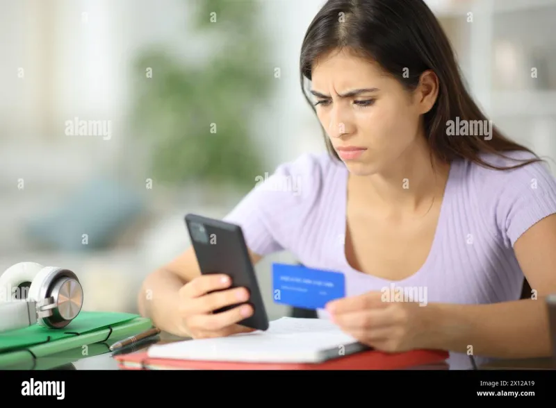
Stored payment information is convenient — genuinely. But it also removes one of the most natural friction points in the purchase process: entering your card number.
When checkout takes three clicks instead of thirty seconds of typing, impulse purchases become dramatically easier. Platforms like Amazon have built entire business models around this concept. One-click buying is a feature, but it's also a deliberate reduction of the psychological speed bump that might otherwise give you pause.
This doesn't mean you should delete your saved payment info — convenience has real value. But it's worth being aware that the ease of checkout is part of what makes overspending so effortless.
Recommended Products and "Frequently Bought Together"
Product recommendations aren't inherently manipulative — sometimes they're genuinely useful. But the placement and framing matter.
When suggested items appear inside your cart, right next to your total, they're positioned at the moment of highest purchase intent. You've already decided to spend money. Your mental "buying mode" is fully activated. Adding one more small item feels trivial.
This is also why "just $X more for free shipping" is so effective. The free shipping threshold is often set at a level that's just slightly above where most carts land naturally — nudging you to add something to qualify, even if the item itself isn't something you needed.
How to Shop Smarter Starting Today
None of this means online shopping is something to avoid — it's genuinely convenient and often the smartest way to find good prices. But a little awareness goes a long way.
- Slow down at checkout. Read every screen before clicking "Continue."
- Look for pre-checked boxes and deselect anything you didn't actively choose.
- Verify purchase type — one-time vs. subscription — before adding to cart.
- Ignore countdown timers until you've decided whether you actually want the product.
- Build a cart, then walk away for a few minutes before finalizing. It breaks the urgency spell.
- Review your order confirmation email immediately after purchase. If something unexpected appears, contact support right away — most reputable retailers will fix it.
At HNB Shop, the goal has always been straightforward: get you what you need, delivered without hassle. That means being upfront about what you're buying and why. Understanding the tactics being used against you elsewhere is part of shopping smarter everywhere — and that's always worth knowing.